Principal component analysis (PCA) applied to Pete Crow-Armstrong. I am willing to bet that every data scientist in an MLB organization has thought of this pun at least once. For good reason: PCA is a powerful tool for dimensionality reduction and feature extraction. In this post, I will walk through the steps of performing PCA on a dataset of Pete Crow-Armstrong’s game-by-game statistics from the 2025 MLB season. Let’s dig into some formalities.
Understanding PCA - the Methodology
To first understand why PCA is useful, we need to understand the curse of dimensionality. Observe Table 1 which shows the exponential growth of possible values with binary variables.
Table 1: Exponential Growth of Possible Values with Binary Variables
n
Possible Values
1
2^1 = 2
2
2^2 = 4
3
2^3 = 8
…
…
10
2^{10} = 1024
20
2^{20} = 1,048,576
When n=1, the possible values are 0 or 1. Now, consider a dataset with two binary variables. This dataset can take on four values: (0,0), (0,1), (1,0), and (1,1). As we add more binary variables, the number of possible combinations grows exponentially. For example, with 10 binary variables, there are 1,024 possible combinations. With 20 binary variables, there are 1,048,576 possible combinations. This example illustrates the curse of dimensionality: as the number of dimensions increases, the volume of the space increases so quickly that the available data becomes sparse.
Now consider a dataset with continuous variables for game-by-game statistics. In the statcast era, there are hundreds of statistics available for each player. How do we reduce the number of dimensions while retaining the most important information? PCA transforms the original variables into a new set of variables, called principal components, which are linear combinations of the original variables. The principal components are ordered such that the first component explains the largest amount of variance in the data, the second component explains the second largest amount of variance, and so on. By selecting a subset of the principal components, we can reduce the dimensionality of the data while retaining most of the important information.
Code
import numpy as npimport matplotlib.pyplot as pltdef plot_pca_vectors():""" Generates 2D data, calculates PCA, and plots the data points with eigenvectors scaled by eigenvalues overlaid. """# --- 1. Generate Sample Data ---# Use a random seed for reproducibility np.random.seed(42)# Create 200 data points (n=200) with 2 features (p=2)# Define a mean to shift the data away from the origin mean = [10, 5]# Define a covariance matrix that creates a stretched, diagonal cloud of points cov = [[5, 4], [4, 5]] X = np.random.multivariate_normal(mean, cov, 200)# --- 2. Perform PCA Calculations ---# Step 2a: Calculate the mean of the data data_mean = np.mean(X, axis=0)# Step 2b: Center the data (though not strictly necessary for covariance calculation with np.cov) X_centered = X - data_mean# Step 2c: Calculate the covariance matrix cov_matrix = np.cov(X_centered, rowvar=False)# Step 2d: Calculate eigenvectors and eigenvalues eigenvalues, eigenvectors = np.linalg.eig(cov_matrix)# --- 3. Create the Plot --- plt.style.use('seaborn-v0_8-whitegrid') fig, ax = plt.subplots(figsize=(7, 5))# Plot the original data points ax.scatter(X[:, 0], X[:, 1], alpha=0.6, label='Data Points')# Plot the mean of the data ax.scatter(data_mean[0], data_mean[1], color='red', s=150, zorder=5, label='Mean')# --- 4. Plot the Eigenvectors ---# The eigenvectors are the directions.# The eigenvalues are the magnitude (variance) in those directions.# We scale the vectors by the sqrt of the eigenvalue to represent standard deviation.print("Eigenvalues:", eigenvalues)print("Eigenvectors:\n", eigenvectors)# Plot each eigenvector as a vector originating from the meanfor i inrange(len(eigenvalues)): eigenvec = eigenvectors[:, i]# The vector's components are scaled by the sqrt of the eigenvalue scaled_vec = eigenvec * np.sqrt(eigenvalues[i]) *2# Multiply by 2 for better visibility# Use ax.quiver to draw an arrow# The arguments are: start_x, start_y, direction_x, direction_y ax.quiver(data_mean[0], data_mean[1], scaled_vec[0], scaled_vec[1], color='g'if i ==0else'm', # Different colors for PC1 and PC2 angles='xy', scale_units='xy', scale=1, width=0.01, label=f'PC{i+1} (λ={eigenvalues[i]:.2f})')# --- 5. Finalize the Plot --- ax.set_aspect('equal', adjustable='box') # Ensures vectors that are orthogonal appear at 90 degrees ax.set_title('Scatter Plot of Data with PCA Eigenvectors', fontsize=16) ax.set_xlabel('Feature 1', fontsize=12) ax.set_ylabel('Feature 2', fontsize=12) ax.legend() ax.grid(True) plt.show()# Run the functionplot_pca_vectors()
Figure 1: Scatter Plot of Data with PCA Eigenvectors
Let X be an n \times p data matrix, where n is the number of observations and p is the number of variables. PCA finds a vector w such that the projection of the data onto w maximizes the variance; w are the principal components. We’re mapping the original data to a new coordinates t. So a data point x_i maps to t_i by finding x_i \dot w_k. Since we’re dealing with matrices, we can express this transformation as T=XW, resulting in a new n\times k matrix which is more compact than X. How is W found? We use eigendecomposition. Observe Figure 1 which shows the original data and the principal components. We are treading in linear algebra territory, and, admittedly, its been several years since I took linear algebra, so I encourage you all to read the wikipedia page. This is exactly that computer science majors mean when they say “linear algebra is a useful math course”.
Understanding PCA - the Player
Let’s start by looking at the data. We will use Pete Crow-Armstrong’s game-by-game statistics from the 2025 MLB season. The data is sourced from Baseball Savant’s search tool. The query I used grabs traditional statistics, expected statistics, and swing mechanic statistics. This video also serves as good tutorial for understanding how to use PCA (he also uses Pete Crow-Armstrong as an example). Some of my results below are inspired by this video but all code, analysis, and visualizations are my own. We also expand upon his analysis by including statcast metrics.
Tip
You can either download the results (middle icon) with your query from the search tool as a CSV file or the entire data (right icon) prior to any filtering on baseball savant.
Code
from pybaseball import statcast_batterfrom pybaseball import playerid_lookupimport pandas as pdimport seaborn as snssns.set_theme(style="whitegrid", palette="pastel")from sklearn.decomposition import PCAfrom sklearn.preprocessing import StandardScalerfrom scipy import statsfrom factor_analyzer.rotator import Rotatordf = pd.read_csv("savant_data.csv")print(f"Number of columns: {len(df.columns.to_list())}")
Number of columns: 78
The original data contains 78 columns. Our goal is to reduce this to fewer than 10 columns. It would be impractical to plot scatter plots for every pair of variables to find correlations. Instead, let’s use a heatmap to visualize the correlations between the variables, as shown in Figure 2.
Figure 2: Pete Crow-Armstrong’s 2025 Game-by-Game Statistics Correlation Heatmap
Observe how some variables, such as slg, woba, and xwoba, are highly correlated. Meanwhile, variables like strikeouts and whiffs show weaker or even opposite correlations with these metrics. If we were to plug this entire dataset into a regression model, such as linear regression, we might run into issues with multicollinearity.
Performing PCA with Two Components
Let’s perform PCA with two components to get a feel for how PCA works. We will use the scikit-learn library. Table Table 2 shows the communalities for each feature. This value represents the amount of variance in each variable that is accounted for by the principal components. The “Initial” column shows the initial communality, which is always 1.0 for PCA since each variable is perfectly correlated with itself. The “Extraction” column shows the communality after extracting the principal components. For example, the woba feature has an extraction communality of 0.877, meaning that 87.7% of the variance in woba is explained by the two principal components. Conversely, triples are not well captured (4.0%) given their rare occurrences.
Code
from IPython.display import Markdownfrom tabulate import tabulate# Perform PCA with 2 components for explorationpca = PCA(n_components=2)pca.fit(X_scaled)loadings = pca.components_.T * np.sqrt(pca.explained_variance_)loadings_df = pd.DataFrame(loadings, columns=[f'PC{i+1}'for i inrange(2)], index=X.columns)# Create the Communalities tablecommunalities = pd.DataFrame({# The 'Initial' communality is always 1.0 for PCA'Initial': 1.0,# 'Extraction' is the sum of the squared loadings for each variable'Extraction': (loadings_df **2).sum(axis=1)})communalities.index.name ='Features'# sort by Extraction value descendingcommunalities = communalities.sort_values(by='Extraction', ascending=False)Markdown(tabulate(communalities.round(3), headers='keys'))
Table 2: Communalities Table
Features
Initial
Extraction
woba
1
0.877
slg
1
0.86
ba
1
0.822
xwoba
1
0.813
obp
1
0.782
xslg
1
0.779
hits
1
0.76
xba
1
0.712
iso
1
0.712
xobp
1
0.67
barrels_total
1
0.612
attack_angle
1
0.582
hrs
1
0.575
swing_length
1
0.568
bat_speed
1
0.5
launch_speed
1
0.421
singles
1
0.343
so
1
0.291
launch_angle
1
0.233
whiffs
1
0.188
rate_ideal_attack_angle
1
0.123
doubles
1
0.113
triples
1
0.04
swing_path_tilt
1
0.015
velocity
1
0.014
bb
1
0.006
attack_direction
1
0.004
Generally, a communality above 0.7 is considered good, indicating that the variable is well captured. So we can see that with only two components, we are able to explain a significant amount of variance in most of the features, namely the main offensive metrics. However, let’s investigate further by examining a technique to determine the optimal number of components to retain.
Determining the Optimal Number of Components
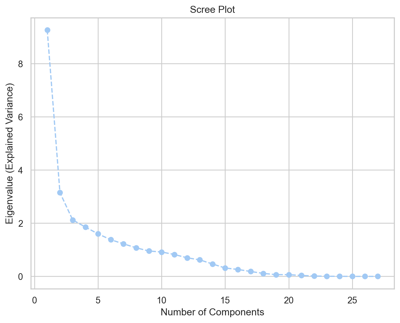
Similarly to k-means clustering, we can use the elbow method to determine the optimal number of components for PCA. The idea is to fit the PCA model with the number of components equal to the number of features, and then plot the explained variance to see where the “elbow” point is. Figure 3 shows the scree plot. As a general rule of thumb, we want to select eigenvalues greater than 1.0.
Code
pca = PCA()pca.fit(X_scaled)# Display explained variance ratio as a tableexplained_var_df = pd.DataFrame({"Eigenvalue": np.round(pca.explained_variance_, 3),"Explained Variance Ratio": np.round(pca.explained_variance_ratio_, 3),"Cumulative Explained Variance": np.round(np.cumsum(pca.explained_variance_ratio_), 3),}, index=[f"{i+1}"for i inrange(len(pca.explained_variance_))])explained_var_df.index.name ="Component"# Use the 'eigenvalues' from the previous stepeigenvalues = pca.explained_variance_plt.figure(figsize=(8, 6))plt.plot(range(1, len(eigenvalues) +1), eigenvalues, marker='o', linestyle='--')plt.title('Scree Plot')plt.xlabel('Number of Components')plt.ylabel('Eigenvalue (Explained Variance)')plt.grid(True)plt.show()
Figure 3: Scree Plot
Table 3 shows the explained variance table. We can see that the first eight components have eigenvalues greater than 1.0 and together explain 79.6% of the variance. Therefore, we will retain eight components for our final PCA model. For sports analytics, retaining 75% to 80% of the variance is sufficient for most applications.
Finally, let’s fit a PCA model with eight components.
Code
pca = PCA(n_components=8)pca.fit(X_scaled)# Display explained variance ratio as a tableexplained_var_df = pd.DataFrame({"Eigenvalue": np.round(pca.explained_variance_, 3),"Explained Variance Ratio": np.round(pca.explained_variance_ratio_, 3),"Cumulative Explained Variance": np.round(np.cumsum(pca.explained_variance_ratio_), 3),}, index=[f"{i+1}"for i inrange(len(pca.explained_variance_))])explained_var_df.index.name ="Component"Markdown(tabulate(explained_var_df, headers='keys'))
Table 4: Explained Variance Table with 8 Components
Component
Eigenvalue
Explained Variance Ratio
Cumulative Explained Variance
1
9.264
0.34
0.34
2
3.151
0.116
0.456
3
2.124
0.078
0.534
4
1.856
0.068
0.602
5
1.598
0.059
0.661
6
1.379
0.051
0.712
7
1.224
0.045
0.757
8
1.074
0.039
0.796
Looking at Table 4, the first component explains 35% of the variance; its eigenvalue of 9.26 means that this component explains as much variance as 9.26 of the original variables. The second component explains an additional 11.6% of the variance, and so on. The weakest component is PC8, which explains 3.9% of the variance, but its eigenvalue is still greater than 1, suggesting it captures some meaningful information.
To see which features fall under each component, we can look at the component matrix (or loadings) in Table 5. The loadings represent the correlation between each original variable and the principal components. High absolute values indicate a strong relationship. For clarity, we will display only loadings with an absolute value greater than 0.3.
Code
# Calculate the Component Matrix (loadings)loadings = pca.components_.T * np.sqrt(pca.explained_variance_)# Format into a pandas DataFramecomponent_matrix = pd.DataFrame(loadings, columns=[f'PC{i+1}'for i inrange(8)], index=X.columns)component_matrix = component_matrix.applymap(lambda x: f'{x:.3f}'ifabs(x) >0.3else'')Markdown(tabulate(component_matrix, headers='keys'))
Table 5: Component Matrix (Loadings)
Features
PC1
PC2
PC3
PC4
PC5
PC6
PC7
PC8
ba
0.886
0.370
iso
0.800
0.435
slg
0.921
0.327
woba
0.936
xwoba
0.901
xba
0.823
-0.311
hits
0.851
0.399
launch_speed
0.408
0.505
0.395
launch_angle
0.474
0.330
0.371
velocity
0.444
0.310
whiffs
0.330
0.511
-0.468
bat_speed
0.676
-0.349
swing_length
0.751
-0.426
0.301
singles
0.394
-0.433
-0.363
0.495
doubles
0.334
0.328
0.416
triples
0.384
-0.311
hrs
0.694
0.305
0.312
so
-0.462
0.540
bb
-0.387
0.765
obp
0.844
0.403
barrels_total
0.703
0.343
-0.408
xobp
0.760
-0.304
0.388
xslg
0.871
-0.383
attack_angle
0.762
-0.339
attack_direction
0.707
swing_path_tilt
-0.354
0.653
rate_ideal_attack_angle
0.307
-0.346
0.543
Table 5 can be overwhelming at first glance because it shows feature membership across all eight components. To make it more interpretable, we can apply a varimax rotation to the component matrix. The goal of varimax rotation is to maximize the variance of the squared loadings within each component, which tends to produce a simpler and more interpretable structure. After rotation, each feature will ideally load highly on one component and have low loadings on others, making it easier to identify which features are associated with each principal component.
Table 6 shows the rotated component matrix, sorted by the feature with the highest absolute loading. Here, we can see clusters of features that load highly on specific components. For example, PC1 has high loadings for iso, slg, woba, xba, launch_speed, xslg, and barrels_total, indicating that this component captures overall offensive performance.
PC2 has high loadings for attack_angle, bat_speed, and swing_length, suggesting it represents swing mechanics. Other components capture different aspects of performance, such as plate discipline (PC3 with bb and obp) and contact quality (PC4 with hits and singles).
Code
rotator = Rotator(method='varimax')rotated_loadings = rotator.fit_transform(loadings)rotated_loadings_df = pd.DataFrame( rotated_loadings, columns=[f'PC{i+1}'for i inrange(rotated_loadings.shape[1])], index=features)# Sort by the component with the highest absolute loading for better visualizationmax_loading_component = rotated_loadings_df.abs().idxmax(axis=1)sorted_index = max_loading_component.sort_values().indexrotated_component_matrix_sorted = rotated_loadings_df.loc[sorted_index]rotated_component_matrix_sorted = rotated_component_matrix_sorted.applymap(lambda x: f'{x:.3f}'ifabs(x) >0.3else'')Markdown(tabulate(rotated_component_matrix_sorted, headers='keys'))
Table 6: Rotated Component Matrix (Loadings)
PC1
PC2
PC3
PC4
PC5
PC6
PC7
PC8
iso
0.899
slg
0.813
0.487
woba
0.687
0.640
xwoba
0.789
-0.362
0.331
xba
0.593
-0.389
0.503
launch_speed
0.477
0.416
0.335
xslg
0.876
-0.313
barrels_total
0.855
hrs
0.862
attack_angle
0.852
bat_speed
0.803
swing_length
0.901
rate_ideal_attack_angle
0.400
-0.512
-0.372
whiffs
0.831
so
0.729
obp
0.400
0.808
0.342
ba
0.455
0.861
hits
0.418
0.872
singles
0.877
velocity
0.632
attack_direction
0.719
bb
0.902
xobp
0.489
-0.347
0.465
0.564
swing_path_tilt
0.737
triples
-0.551
doubles
0.676
launch_angle
0.324
0.687
In summary, Pete Crow-Armstrong’s game-by-game statistics can be categorized into eight groups:
Original shape: (125, 27)
Transformed shape: (125, 8)
As of writing this, Pete Crow-Armstrong is in a slump. His OPS barely sits above 0.802 and his rolling xwOBA is currently at 0.281. Given our newly found PCA features, let’s plot his performance over the season. Figure 4 shows the rolling average of each principal component over the season. We can see that his elite power and contact quality (PC1) has been declining, as well as his swing mechanics (PC2). His on-base ability (PC4) has also been below average. This visualization can help identify areas for improvement and track progress over time.
Code
import plotly.graph_objs as gowindow =10fig = go.Figure()# Use a less saturated, pastel color palettecolors = {'PC2': 'mediumseagreen', # muted green'PC3': 'lightsalmon', # soft orange'PC4': 'cornflowerblue'# soft blue}# PC1fig.add_trace(go.Scatter( x=df_pca['Game'], y=df_pca['PC1'].rolling(window).mean(), mode='lines', name=f'PC1: Elite Power & Contact Quality ({window}-game avg)', line=dict(color='gold', width=2) # light yellow))# PC2fig.add_trace(go.Scatter( x=df_pca['Game'], y=df_pca['PC2'].rolling(window).mean(), mode='lines', name=f'PC2: Swing Mechanics ({window}-game avg)', line=dict(color=colors['PC2'], width=2)))# PC3fig.add_trace(go.Scatter( x=df_pca['Game'], y=df_pca['PC3'].rolling(window).mean(), mode='lines', name=f'PC3: Swing and Miss Tendencies ({window}-game avg)', line=dict(color=colors['PC3'], width=2)))# PC4fig.add_trace(go.Scatter( x=df_pca['Game'], y=df_pca['PC4'].rolling(window).mean(), mode='lines', name=f'PC4: On-Base Ability ({window}-game avg)', line=dict(color=colors['PC4'], width=2)))fig.add_hline(y=0, line_dash="dash", line_color="grey", line_width=1)fig.update_layout( title="Player's Skill Profile Over the Season (Rolling Avg)", xaxis_title='Game Number', yaxis_title='Component Score (Rolling Mean)', legend_title='Principal Components', xaxis=dict(range=[1, 125]), template='simple_white', legend=dict( orientation="h", yanchor="top", y=-0.25, xanchor="center", x=0.5 ))fig.show();
(a) Pete Crow-Armstrong’s Skill Profile Over the Season (Rolling Avg)
(b)
Figure 4
Conclusion
In this post, we performed PCA on Pete Crow-Armstrong’s game-by-game statistics from the 2025 MLB season. We started by exploring the data and visualizing correlations between variables. We then applied PCA to reduce the dimensionality of the dataset while retaining most of the important information. By examining the communalities and scree plot, we determined that retaining eight components was optimal. Finally, we interpreted the components using a varimax rotation, which revealed distinct themes related to offensive performance, swing mechanics, plate discipline, and more.
We started with 27 features and ended with eight rotated components, distilling Pete Crow-Armstrong’s season into actionable levers. A spike in the decision component alongside a flat contact-quality component suggests selectivity gains arriving before slug; a swing-path surge without decision support hints at over-aggression masquerading as form.
In daily box scores, noise drowns signal. Principal component analysis doesn’t tell us whether a hot streak is coming; it shows how one would be built—better decisions, a cleaner path, louder contact, pressure after contact—so that when one dial twitches, everyone knows which adjustment matters next. Let’s hope Pete Crow-Armstrong finds the right signal among the noise.
---title: "Principal Component Analysis Explained: A Practical Example with MLB Data in Python"aliases: - "/posts/pca-on-pca/index.html" - "/posts/pca-on-pca/" - "/posts/pca-on-pca" - "/pca-on-pca/index.html"author: "Oliver Chang"email: oliverc1622@gmail.comdate: 2025-08-24 # Update this date when you make changescategories: [dimensionality reduction, PCA, scikit-learn, cubs]toc: trueformat: html: html-math-method: katex code-tools: trueimage: "player-shadow.png"bibliography: references.bibtitle-block-banner: default---<iframe src="https://streamable.com/m/cade-horton-in-play-out-s-to-taylor-ward?partnerId=web_video-playback-page_video-share" width="560" height="315"></iframe>## IntroductionPrincipal component analysis (PCA) applied to Pete Crow-Armstrong. I am willing to bet that every data scientist in an MLB organization has thought of this pun at least once. For good reason: PCA is a powerful tool for dimensionality reduction and feature extraction. In this post, I will walk through the steps of performing PCA on a dataset of Pete Crow-Armstrong's game-by-game statistics from the 2025 MLB season. Let's dig into some formalities.### Understanding PCA - the MethodologyTo first understand why PCA is useful, we need to understand the [curse of dimensionality](https://en.wikipedia.org/wiki/Curse_of_dimensionality). Observe @tbl-exp which shows the exponential growth of possible values with binary variables.| n | Possible Values ||---|-----------------|| 1 | $2^1 = 2$ || 2 | $2^2 = 4$ || 3 | $2^3 = 8$ || ... | ... || 10 | $2^{10} = 1024$ || 20 | $2^{20} = 1,048,576$ |: Exponential Growth of Possible Values with Binary Variables {#tbl-exp}When $n=1$, the possible values are 0 or 1. Now, consider a dataset with two binary variables. This dataset can take on four values: (0,0), (0,1), (1,0), and (1,1). As we add more binary variables, the number of possible combinations grows exponentially. For example, with 10 binary variables, there are 1,024 possible combinations. With 20 binary variables, there are 1,048,576 possible combinations. This example illustrates the curse of dimensionality: as the number of dimensions increases, the volume of the space increases so quickly that the available data becomes sparse.Now consider a dataset with continuous variables for game-by-game statistics. In the statcast era, there are hundreds of [statistics](https://www.mlb.com/glossary) available for each player. How do we reduce the number of dimensions while retaining the most important information? PCA transforms the original variables into a new set of variables, called principal components, which are linear combinations of the original variables. The principal components are ordered such that the first component explains the largest amount of variance in the data, the second component explains the second largest amount of variance, and so on. By selecting a subset of the principal components, we can reduce the dimensionality of the data while retaining most of the important information.```{python}#| code-fold: true#| warning: false#| fig-cap: "Scatter Plot of Data with PCA Eigenvectors"#| label: fig-pca-vectors#| fig-alt: "A scatter plot with two eigenvectors overlaid."import numpy as npimport matplotlib.pyplot as pltdef plot_pca_vectors():""" Generates 2D data, calculates PCA, and plots the data points with eigenvectors scaled by eigenvalues overlaid. """# --- 1. Generate Sample Data ---# Use a random seed for reproducibility np.random.seed(42)# Create 200 data points (n=200) with 2 features (p=2)# Define a mean to shift the data away from the origin mean = [10, 5]# Define a covariance matrix that creates a stretched, diagonal cloud of points cov = [[5, 4], [4, 5]] X = np.random.multivariate_normal(mean, cov, 200)# --- 2. Perform PCA Calculations ---# Step 2a: Calculate the mean of the data data_mean = np.mean(X, axis=0)# Step 2b: Center the data (though not strictly necessary for covariance calculation with np.cov) X_centered = X - data_mean# Step 2c: Calculate the covariance matrix cov_matrix = np.cov(X_centered, rowvar=False)# Step 2d: Calculate eigenvectors and eigenvalues eigenvalues, eigenvectors = np.linalg.eig(cov_matrix)# --- 3. Create the Plot --- plt.style.use('seaborn-v0_8-whitegrid') fig, ax = plt.subplots(figsize=(7, 5))# Plot the original data points ax.scatter(X[:, 0], X[:, 1], alpha=0.6, label='Data Points')# Plot the mean of the data ax.scatter(data_mean[0], data_mean[1], color='red', s=150, zorder=5, label='Mean')# --- 4. Plot the Eigenvectors ---# The eigenvectors are the directions.# The eigenvalues are the magnitude (variance) in those directions.# We scale the vectors by the sqrt of the eigenvalue to represent standard deviation.print("Eigenvalues:", eigenvalues)print("Eigenvectors:\n", eigenvectors)# Plot each eigenvector as a vector originating from the meanfor i inrange(len(eigenvalues)): eigenvec = eigenvectors[:, i]# The vector's components are scaled by the sqrt of the eigenvalue scaled_vec = eigenvec * np.sqrt(eigenvalues[i]) *2# Multiply by 2 for better visibility# Use ax.quiver to draw an arrow# The arguments are: start_x, start_y, direction_x, direction_y ax.quiver(data_mean[0], data_mean[1], scaled_vec[0], scaled_vec[1], color='g'if i ==0else'm', # Different colors for PC1 and PC2 angles='xy', scale_units='xy', scale=1, width=0.01, label=f'PC{i+1} (λ={eigenvalues[i]:.2f})')# --- 5. Finalize the Plot --- ax.set_aspect('equal', adjustable='box') # Ensures vectors that are orthogonal appear at 90 degrees ax.set_title('Scatter Plot of Data with PCA Eigenvectors', fontsize=16) ax.set_xlabel('Feature 1', fontsize=12) ax.set_ylabel('Feature 2', fontsize=12) ax.legend() ax.grid(True) plt.show()# Run the functionplot_pca_vectors()```Let $X$ be an $n \times p$ data matrix, where $n$ is the number of observations and $p$ is the number of variables. PCA finds a vector $w$ such that the projection of the data onto $w$ maximizes the variance; $w$ are the principal components. We're mapping the original data to a new coordinates $t$. So a data point $x_i$ maps to $t_i$ by finding $x_i \dot w_k$. Since we're dealing with matrices, we can express this transformation as $T=XW$, resulting in a new $n\times k$ matrix which is more compact than $X$. How is $W$ found? We use [eigendecomposition](https://en.wikipedia.org/wiki/Eigendecomposition_of_a_matrix). Observe @fig-pca-vectors which shows the original data and the principal components. We are treading in linear algebra territory, and, admittedly, its been several years since I took linear algebra, so I encourage you all to read the wikipedia page. This is exactly that computer science majors mean when they say "linear algebra is a useful math course".## Understanding PCA - the PlayerLet's start by looking at the data. We will use Pete Crow-Armstrong's game-by-game statistics from the 2025 MLB season. The data is sourced from [Baseball Savant's](https://baseballsavant.mlb.com/statcast_search?hfPT=&hfAB=&hfGT=R%7C&hfPR=&hfZ=&hfStadium=&hfBBL=&hfNewZones=&hfPull=&hfC=&hfSea=2025%7C&hfSit=&player_type=batter&hfOuts=&hfOpponent=&pitcher_throws=&batter_stands=&hfSA=&game_date_gt=&game_date_lt=&hfMo=&hfTeam=&home_road=&hfRO=&position=&hfInfield=&hfOutfield=&hfInn=&hfBBT=&batters_lookup%5B%5D=691718&hfFlag=&metric_1=&group_by=name-date&min_pitches=0&min_results=0&min_pas=0&sort_col=pitches&player_event_sort=api_p_release_speed&sort_order=desc&chk_stats_ba=on&chk_stats_xba=on&chk_stats_obp=on&chk_stats_xobp=on&chk_stats_slg=on&chk_stats_xslg=on&chk_stats_woba=on&chk_stats_xwoba=on&chk_stats_barrels_total=on&chk_stats_iso=on&chk_stats_swing_miss_percent=on&chk_stats_launch_speed=on&chk_stats_launch_angle=on&chk_stats_bbdist=on&chk_stats_hardhit_percent=on&chk_stats_barrels_per_pa_percent=on&chk_stats_sweetspot_speed_mph=on&chk_stats_attack_angle=on&chk_stats_swing_length=on&chk_stats_attack_direction=on&chk_stats_swing_path_tilt=on&chk_stats_rate_ideal_attack_angle=on&chk_stats_intercept_ball_minus_batter_pos_x_inches=on&chk_stats_intercept_ball_minus_batter_pos_y_inches=on#results) search tool. The query I used grabs traditional statistics, expected statistics, and swing mechanic statistics. This [video](https://youtu.be/E4z2LUJRLJ4?si=GqgBERMszgsyilO9) also serves as good tutorial for understanding how to use PCA (he also uses Pete Crow-Armstrong as an example). Some of my results below are inspired by this video but all code, analysis, and visualizations are my own. We also expand upon his analysis by including statcast metrics.::: {.callout-tip}You can either download the results (middle icon) with your query from the search tool as a CSV file or the entire data (right icon) prior to any filtering on baseball savant.:::```{python}#| code-fold: true#| warning: falsefrom pybaseball import statcast_batterfrom pybaseball import playerid_lookupimport pandas as pdimport seaborn as snssns.set_theme(style="whitegrid", palette="pastel")from sklearn.decomposition import PCAfrom sklearn.preprocessing import StandardScalerfrom scipy import statsfrom factor_analyzer.rotator import Rotatordf = pd.read_csv("savant_data.csv")print(f"Number of columns: {len(df.columns.to_list())}")```The original data contains 78 columns. Our goal is to reduce this to fewer than 10 columns. It would be impractical to plot scatter plots for every pair of variables to find correlations. Instead, let's use a heatmap to visualize the correlations between the variables, as shown in @fig-heatmap.```{python}#| code-fold: true#| warning: false#| fig-cap: "Pete Crow-Armstrong's 2025 Game-by-Game Statistics Correlation Heatmap"#| label: fig-heatmap#| fig-alt: "A heatmap showing correlations."# select relevant featuresfeatures = ["ba", "iso", "slg", "woba", "xwoba", "xba", "hits", "launch_speed", "launch_angle", "velocity", "whiffs", "bat_speed", "swing_length", "singles", "doubles", "triples", "hrs", "so", "bb","obp", "barrels_total", "xobp", "xslg", "attack_angle", "attack_direction", "swing_path_tilt","rate_ideal_attack_angle"]X = df[features]X = X.dropna()scaler = StandardScaler()X_scaled = scaler.fit_transform(X)# heatmapcorr = X.corr()mask = np.triu(np.ones_like(corr, dtype=bool))f, ax = plt.subplots(figsize=(9, 7))cmap = sns.diverging_palette(230, 20, as_cmap=True)sns.heatmap(corr, mask=mask, cmap=cmap, vmax=1.0, center=0, square=True, linewidths=.5, cbar_kws={"shrink": .5})```Observe how some variables, such as `slg`, `woba`, and `xwoba`, are highly correlated. Meanwhile, variables like strikeouts and whiffs show weaker or even opposite correlations with these metrics. If we were to plug this entire dataset into a regression model, such as [linear regression](https://runningonnumbers.com/posts/ops-linear-regression/), we might run into issues with [multicollinearity](https://en.wikipedia.org/wiki/Multicollinearity).### Performing PCA with Two ComponentsLet's perform PCA with two components to get a feel for how PCA works. We will use the `scikit-learn` library. Table @tbl-communalities shows the communalities for each feature. This value represents the amount of variance in each variable that is accounted for by the principal components. The "Initial" column shows the initial communality, which is always 1.0 for PCA since each variable is perfectly correlated with itself. The "Extraction" column shows the communality after extracting the principal components. For example, the `woba` feature has an extraction communality of 0.877, meaning that 87.7% of the variance in `woba` is explained by the two principal components. Conversely, triples are not well captured (4.0%) given their rare occurrences.```{python}# | code-fold: true# | warning: false# | tbl-cap: "Communalities Table"# | label: tbl-communalities# | tbl-alt: "A table showing the communalities for each feature."from IPython.display import Markdownfrom tabulate import tabulate# Perform PCA with 2 components for explorationpca = PCA(n_components=2)pca.fit(X_scaled)loadings = pca.components_.T * np.sqrt(pca.explained_variance_)loadings_df = pd.DataFrame(loadings, columns=[f'PC{i+1}'for i inrange(2)], index=X.columns)# Create the Communalities tablecommunalities = pd.DataFrame({# The 'Initial' communality is always 1.0 for PCA'Initial': 1.0,# 'Extraction' is the sum of the squared loadings for each variable'Extraction': (loadings_df **2).sum(axis=1)})communalities.index.name ='Features'# sort by Extraction value descendingcommunalities = communalities.sort_values(by='Extraction', ascending=False)Markdown(tabulate(communalities.round(3), headers='keys'))```Generally, a communality above 0.7 is considered good, indicating that the variable is well captured. So we can see that with only two components, we are able to explain a significant amount of variance in most of the features, namely the main offensive metrics. However, let's investigate further by examining a technique to determine the optimal number of components to retain.### Determining the Optimal Number of ComponentsSimilarly to [k-means clustering](https://runningonnumbers.com/posts/k-means/), we can use the elbow method to determine the optimal number of components for PCA. The idea is to fit the PCA model with the number of components equal to the number of features, and then plot the explained variance to see where the "elbow" point is. @fig-scree shows the scree plot. As a [general rule of thumb](https://en.wikipedia.org/wiki/Factor_analysis#Older_methods), we want to select eigenvalues greater than 1.0.```{python}#| code-fold: true#| warning: false#| fig-cap: "Scree Plot"#| label: fig-scree#| fig-alt: "A scree plot showing the eigenvalues."pca = PCA()pca.fit(X_scaled)# Display explained variance ratio as a tableexplained_var_df = pd.DataFrame({"Eigenvalue": np.round(pca.explained_variance_, 3),"Explained Variance Ratio": np.round(pca.explained_variance_ratio_, 3),"Cumulative Explained Variance": np.round(np.cumsum(pca.explained_variance_ratio_), 3),}, index=[f"{i+1}"for i inrange(len(pca.explained_variance_))])explained_var_df.index.name ="Component"# Use the 'eigenvalues' from the previous stepeigenvalues = pca.explained_variance_plt.figure(figsize=(8, 6))plt.plot(range(1, len(eigenvalues) +1), eigenvalues, marker='o', linestyle='--')plt.title('Scree Plot')plt.xlabel('Number of Components')plt.ylabel('Eigenvalue (Explained Variance)')plt.grid(True)plt.show()```@tbl-explained-variance shows the explained variance table. We can see that the first eight components have eigenvalues greater than 1.0 and together explain 79.6% of the variance. Therefore, we will retain eight components for our final PCA model. For sports analytics, retaining 75% to 80% of the variance is sufficient for most applications.```{python}# | code-fold: true# | warning: false# | tbl-cap: "Explained Variance Table"# | label: tbl-explained-variance# | tbl-alt: "A table showing the explained variance for each component."Markdown(tabulate(explained_var_df, headers='keys'))```### Our Magic Number is EightFinally, let's fit a PCA model with eight components. ```{python}# | code-fold: true# | warning: false# | tbl-cap: "Explained Variance Table with 8 Components"# | label: tbl-explained-variance-8# | tbl-alt: "A table showing the explained variance for each component."pca = PCA(n_components=8)pca.fit(X_scaled)# Display explained variance ratio as a tableexplained_var_df = pd.DataFrame({"Eigenvalue": np.round(pca.explained_variance_, 3),"Explained Variance Ratio": np.round(pca.explained_variance_ratio_, 3),"Cumulative Explained Variance": np.round(np.cumsum(pca.explained_variance_ratio_), 3),}, index=[f"{i+1}"for i inrange(len(pca.explained_variance_))])explained_var_df.index.name ="Component"Markdown(tabulate(explained_var_df, headers='keys'))```Looking at @tbl-explained-variance-8, the first component explains 35% of the variance; its eigenvalue of 9.26 means that this component explains as much variance as 9.26 of the original variables. The second component explains an additional 11.6% of the variance, and so on. The weakest component is PC8, which explains 3.9% of the variance, but its eigenvalue is still greater than 1, suggesting it captures some meaningful information.To see which features fall under each component, we can look at the component matrix (or loadings) in @tbl-component-matrix. The loadings represent the correlation between each original variable and the principal components. High absolute values indicate a strong relationship. For clarity, we will display only loadings with an absolute value greater than 0.3.```{python}# | code-fold: true# | warning: false# | tbl-cap: "Component Matrix (Loadings)"# | label: tbl-component-matrix# | tbl-alt: "A table showing the component matrix (loadings) for each feature"# Calculate the Component Matrix (loadings)loadings = pca.components_.T * np.sqrt(pca.explained_variance_)# Format into a pandas DataFramecomponent_matrix = pd.DataFrame(loadings, columns=[f'PC{i+1}'for i inrange(8)], index=X.columns)component_matrix = component_matrix.applymap(lambda x: f'{x:.3f}'ifabs(x) >0.3else'')Markdown(tabulate(component_matrix, headers='keys'))```@tbl-component-matrix can be overwhelming at first glance because it shows feature membership across all eight components. To make it more interpretable, we can apply a varimax rotation to the component matrix. The goal of varimax rotation is to maximize the variance of the squared loadings within each component, which tends to produce a simpler and more interpretable structure. After rotation, each feature will ideally load highly on one component and have low loadings on others, making it easier to identify which features are associated with each principal component.@tbl-rotated-component-matrix shows the rotated component matrix, sorted by the feature with the highest absolute loading. Here, we can see clusters of features that load highly on specific components. For example, PC1 has high loadings for `iso`, `slg`, `woba`, `xba`, `launch_speed`, `xslg`, and `barrels_total`, indicating that this component captures overall offensive performance.PC2 has high loadings for `attack_angle`, `bat_speed`, and `swing_length`, suggesting it represents swing mechanics. Other components capture different aspects of performance, such as plate discipline (PC3 with `bb` and `obp`) and contact quality (PC4 with `hits` and `singles`).```{python}# | code-fold: true# | warning: false# | tbl-cap: "Rotated Component Matrix (Loadings)"# | label: tbl-rotated-component-matrix# | tbl-alt: "A table showing the rotated component matrix (loadings) for each feature"rotator = Rotator(method='varimax')rotated_loadings = rotator.fit_transform(loadings)rotated_loadings_df = pd.DataFrame( rotated_loadings, columns=[f'PC{i+1}'for i inrange(rotated_loadings.shape[1])], index=features)# Sort by the component with the highest absolute loading for better visualizationmax_loading_component = rotated_loadings_df.abs().idxmax(axis=1)sorted_index = max_loading_component.sort_values().indexrotated_component_matrix_sorted = rotated_loadings_df.loc[sorted_index]rotated_component_matrix_sorted = rotated_component_matrix_sorted.applymap(lambda x: f'{x:.3f}'ifabs(x) >0.3else'')Markdown(tabulate(rotated_component_matrix_sorted, headers='keys'))```In summary, Pete Crow-Armstrong's game-by-game statistics can be categorized into eight groups:1. **Overall Offensive Performance**: PC1- Key variables: `iso`, `slg`, `woba`, `xba`, `launch_speed`, `xslg`, `barrels_total`2. **Swing Mechanics**: PC2- Key variables: `attack_angle`, `bat_speed`, `swing_length`3. **Swing-and-Miss vs Contact**: PC3- Key variables: `whiffs`, `so`, `xwoba`, `xslg`4. **On-Base Ability and Batting Average**: PC4- Key variables: `hits`, `singles`, `obp`, `ba`5. **Performance Against Pitch Velocity**: PC5- Key variables: `launch_speed`, `velocity`, `attack_direction`6. **Plate Discipline**: PC6- Key variables: `bb`, `obp`, `xobp`7. **"All-or-Nothing" Launch Angle Hitter**: PC7- Key variables: `rate_ideal_attack_angle`, `swing_path_tilt`, `triples`8. **Gap Power & Launch Angle**: PC8- Key variables: `doubles`, `launch_angle`For convenience,| Component | Interpreted Theme / Skill ||-----------|---------------------------------------|| PC1 | Elite Power & Contact Quality 🚀 || PC2 | Swing Mechanics ⚙️ || PC3 | Swing-and-Miss Tendency || PC4 | On-Base Ability & Batting Average ⚾ || PC5 | Performance Against Pitch Velocity 🔥 || PC6 | Plate Discipline 👀 || PC7 | "All-or-Nothing" Swing Path || PC8 | Gap Power & Launch Angle |: Summary of Principal Components and Their Interpreted Themes {#tbl-summary}### How to actually use PCA in ML practice?```{python}X_pca = pca.transform(X_scaled)df_pca = pd.DataFrame(X_pca, columns=[f'PC{i+1}'for i inrange(X_pca.shape[1])])df_pca["Game"] = np.arange(1, len(df_pca) +1)print("Original shape:", X_scaled.shape)print("Transformed shape:", X_pca.shape)```As of writing this, Pete Crow-Armstrong is in a slump. His OPS barely sits above 0.802 and his rolling xwOBA is currently at 0.281. Given our newly found PCA features, let's plot his performance over the season. @fig-pca-skill-profile shows the rolling average of each principal component over the season. We can see that his elite power and contact quality (PC1) has been declining, as well as his swing mechanics (PC2). His on-base ability (PC4) has also been below average. This visualization can help identify areas for improvement and track progress over time.```{python}# | code-fold: true# | warning: false# | fig-cap: "Pete Crow-Armstrong's Skill Profile Over the Season (Rolling Avg)"# | label: fig-pca-skill-profile# | fig-alt: "A line plot showing the rolling average of each principal component over the season."import plotly.graph_objs as gowindow =10fig = go.Figure()# Use a less saturated, pastel color palettecolors = {'PC2': 'mediumseagreen', # muted green'PC3': 'lightsalmon', # soft orange'PC4': 'cornflowerblue'# soft blue}# PC1fig.add_trace(go.Scatter( x=df_pca['Game'], y=df_pca['PC1'].rolling(window).mean(), mode='lines', name=f'PC1: Elite Power & Contact Quality ({window}-game avg)', line=dict(color='gold', width=2) # light yellow))# PC2fig.add_trace(go.Scatter( x=df_pca['Game'], y=df_pca['PC2'].rolling(window).mean(), mode='lines', name=f'PC2: Swing Mechanics ({window}-game avg)', line=dict(color=colors['PC2'], width=2)))# PC3fig.add_trace(go.Scatter( x=df_pca['Game'], y=df_pca['PC3'].rolling(window).mean(), mode='lines', name=f'PC3: Swing and Miss Tendencies ({window}-game avg)', line=dict(color=colors['PC3'], width=2)))# PC4fig.add_trace(go.Scatter( x=df_pca['Game'], y=df_pca['PC4'].rolling(window).mean(), mode='lines', name=f'PC4: On-Base Ability ({window}-game avg)', line=dict(color=colors['PC4'], width=2)))fig.add_hline(y=0, line_dash="dash", line_color="grey", line_width=1)fig.update_layout( title="Player's Skill Profile Over the Season (Rolling Avg)", xaxis_title='Game Number', yaxis_title='Component Score (Rolling Mean)', legend_title='Principal Components', xaxis=dict(range=[1, 125]), template='simple_white', legend=dict( orientation="h", yanchor="top", y=-0.25, xanchor="center", x=0.5 ))fig.show();```## ConclusionIn this post, we performed PCA on Pete Crow-Armstrong's game-by-game statistics from the 2025 MLB season. We started by exploring the data and visualizing correlations between variables. We then applied PCA to reduce the dimensionality of the dataset while retaining most of the important information. By examining the communalities and scree plot, we determined that retaining eight components was optimal. Finally, we interpreted the components using a varimax rotation, which revealed distinct themes related to offensive performance, swing mechanics, plate discipline, and more.We started with 27 features and ended with eight rotated components, distilling Pete Crow-Armstrong’s season into actionable levers. A spike in the decision component alongside a flat contact-quality component suggests selectivity gains arriving before slug; a swing-path surge without decision support hints at over-aggression masquerading as form.In daily box scores, noise drowns signal. Principal component analysis doesn’t tell us whether a hot streak is coming; it shows how one would be built—better decisions, a cleaner path, louder contact, pressure after contact—so that when one dial twitches, everyone knows which adjustment matters next. Let's hope Pete Crow-Armstrong finds the right signal among the noise.<iframe src="https://streamable.com/m/pete-crow-armstrong-homers-28-on-a-fly-ball-to-right-center-field?partnerId=web_video-playback-page_video-share" width="560" height="315"></iframe>:::{.callout-note}Past articles: - [K-Nearest Neighbors](https://runningonnumbers.com/posts/k-nearest-neighbors/)- [Support Vector Machine](https://runningonnumbers.com/posts/support-vector-machine/)- [K-Means Clustering](https://runningonnumbers.com/posts/k-means/)Github:- [Running on Numbers](https://github.com/oliverc1623/Running-On-Numbers-Public):::<script async data-uid="5d16db9e50" src="https://runningonnumbers.kit.com/5d16db9e50/index.js"></script>